
A landing page is a page designed to get a specific audience to complete a specific action.Request a quote, book a demo, sign up, or buy. Your job is to connect the promise that attracted the person with sufficient information, a clear decision, and a next step that works. Having few links or a flashy button alone doesn't guarantee conversions.
If someone clicks on an ad for a specific service and lands on a page about the entire company, they have to retrace their steps. A good landing page reduces that effort. But it also filters: it helps identify who the offer is for, what it includes, and when another option might be a better fit.
This guide focuses on designing and measuring that experience. Choosing the domain, hosting, and overall architecture is a separate issue, which we explain in [link to guide]. How to create a website.
What is a landing page and what is it used for?
The term has two uses. In analytics, the entry page can be any URL where a visit begins. In a campaign, we call a landing page a page designed for a specific intent and conversion. Google Ads uses the term for the page a person arrives at after clicking on an ad. Its definition doesn't require it to be a separate URL or a single-page site. Source: Google Ads glossary.
An existing product page or service page can serve this purpose if it's well-suited to the campaign. Creating a new page only makes sense when you need a significantly different proposition, audience, or journey. Creating another URL simply to label it a "landing page" adds maintenance without necessarily solving the problem.
Before designing, complete this sentence: "This page will help [audience] decide if [offer] fits [need] and take [action]." If you need five incompatible actions to complete it, you should review the objective.
Landing page, home page and service page: differences
| Page type | Main question | Expected route |
|---|---|---|
| Start | Who is this company and what does it offer? | Explore various areas and find the right one. |
| Service | How does this company solve my need? | Understand scope, conditions, and alternatives. |
| Campaign landing page | Does this offer match what I just saw? | Evaluate a proposal and complete its main action. |
It's not mandatory to remove all navigation from a landing page. Reducing distractions can be helpful, but visitors still need to know who's behind it, understand the terms and conditions, and review the privacy policy. Hiding this information to force a form undermines trust. Decide which links help visitors evaluate the offer and which ones interrupt the process without providing context.
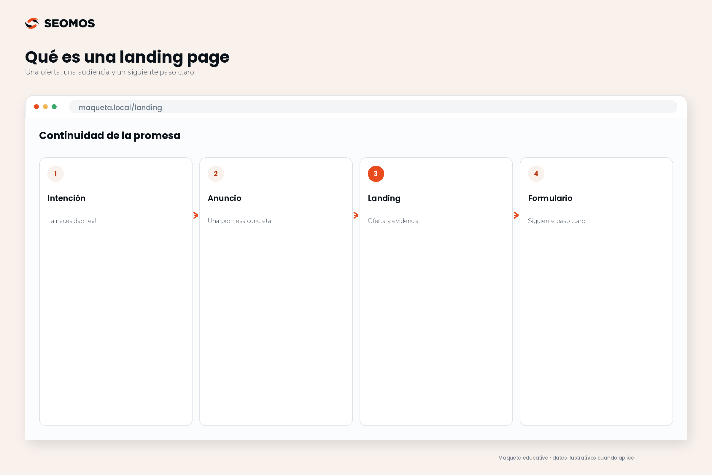
Structure of a landing page that helps to decide
Quick structure template: Specific promise and target audience → verifiable reach and benefits → evidence and response to objections → main form or action → confirmation of the next step. If the campaign requires conditions, pricing, or eligibility requirements, display them before requesting data. On mobile, ensure the message and action remain clear without relying on an image.
Use this sequence as a draft, not a rigid template: a B2B demo may need more evidence than a free download. The next four blocks explain what to write and what to check in each part.
Example of applied structure: For the simulated Organized Classroom demonstration, each group must answer a specific question before requesting data. The following sequence allows you to write a first draft and identify what is missing.
| Block | Example text or content | What to check |
|---|---|---|
| Start | «"Organize reservations and slots for your academy. Request a demonstration of Aula Ordenada.". | The promise matches the announcement and makes the public clear. |
| Scope and testing | Displayed features, usage requirements, and authentic capture of the booking flow. | Evidence can be verified and does not promise results without data. |
| Objections | Compatibility, demonstration conditions and pricing criteria. | The person finds the conditions before sharing their data. |
| Action and confirmation | «"Request a demonstration", short form and message about subsequent coordination. | The shipment arrives at the device and the success message appears only after confirmation. |
This example shows the order of the information, not a performance guarantee. Adapt each block to the offer, the visitor's intent, and the evidence you actually have.
1. A recognizable proposal from the first block
The headline should state what you're offering and who it's for. The supporting text adds the scope or condition, preventing misunderstandings. "Grow your business" could apply to almost any company; "Schedule a demo of the booking system for your academy" lets them know what to expect.
Use the same substantive promise as the source ad. If you're advertising a demo, don't turn the form into a purchase request without explanation. Google recommends that the destination be relevant to the ad and its keywords. This consistency also makes it easier for the user to understand the proposed action. Source: Google Ads recommendations for ads and landing pages.
2. Scope, benefits and verifiable evidence
Explain what the offer includes, what problem it addresses, and what it requires from the client. A benefit needs a clear mechanism: "centralizing requests" is more easily evaluated if you show where they are received and how they are allocated. Avoid turning a potential benefit into a sales guarantee.
Evidence can be an actual demonstration, an authorized capture, specifications, a sample deliverable, or a documented case. Publish testimonials only when they are authentic and authorized. If you don't yet have cases, explain the process honestly; a fabricated figure is no substitute for proof.
3. Responses to objections that are holding back the decision
Include price or quoting criteria where possible, implementation time if confirmed, compatibility, requirements, and exclusions. Not all of this information needs to be in the first section, but it should be available before requesting a commitment.
The appropriate length depends on what needs explaining. A simple download may require little text. A high-commitment contract may require comparisons, frequently asked questions, and a detailed process. Cutting out useful information to make it "all at the top" can also increase uncertainty.
4. One main action with a clear next step
The CTA, or call to action, should describe a consequence: "Request a quote," "Check availability," or "Book a demo." You can repeat it after important blocks of text if it maintains the same intent. You don't need to invent urgency, limited slots, or discounts to make it stand out.
Explain what happens next: who will respond, through which channel, and what information will be needed. Only promise a response timeframe that the team can realistically meet. Post-submission confirmation is part of the experience, even if it's no longer displayed on the landing page.
How to design the form without losing contact quality
Request the information necessary to complete the next step. A quote request may require more context than simply submitting a guide. Removing all fields doesn't always improve business results: you could receive more inquiries than your team can classify or process.
The W3C recommends identifying controls with labels, providing clear instructions, and explaining both errors and success confirmations. The sample text within the field does not replace a persistent label. Source: W3C accessible forms tutorial.
- Field name: Explain what is being requested; avoid internal abbreviations.
- Obligation: distinguishes between necessary and optional data.
- Errors: It indicates what to correct without deleting what has already been written.
- Privacy: It explains the use of the data and separates the request for permission for other communications.
- Confirmation: It shows the actual result of the shipment and avoids duplicate records.
Test the walkthrough using a keyboard, on a phone, and with a limited connection. Also, check what happens when the server fails: a success message appearing without saving the contact results in a false conversion. The review of UX/UI design It must include these states, in addition to the initial appearance.
A practical process for preparing the page
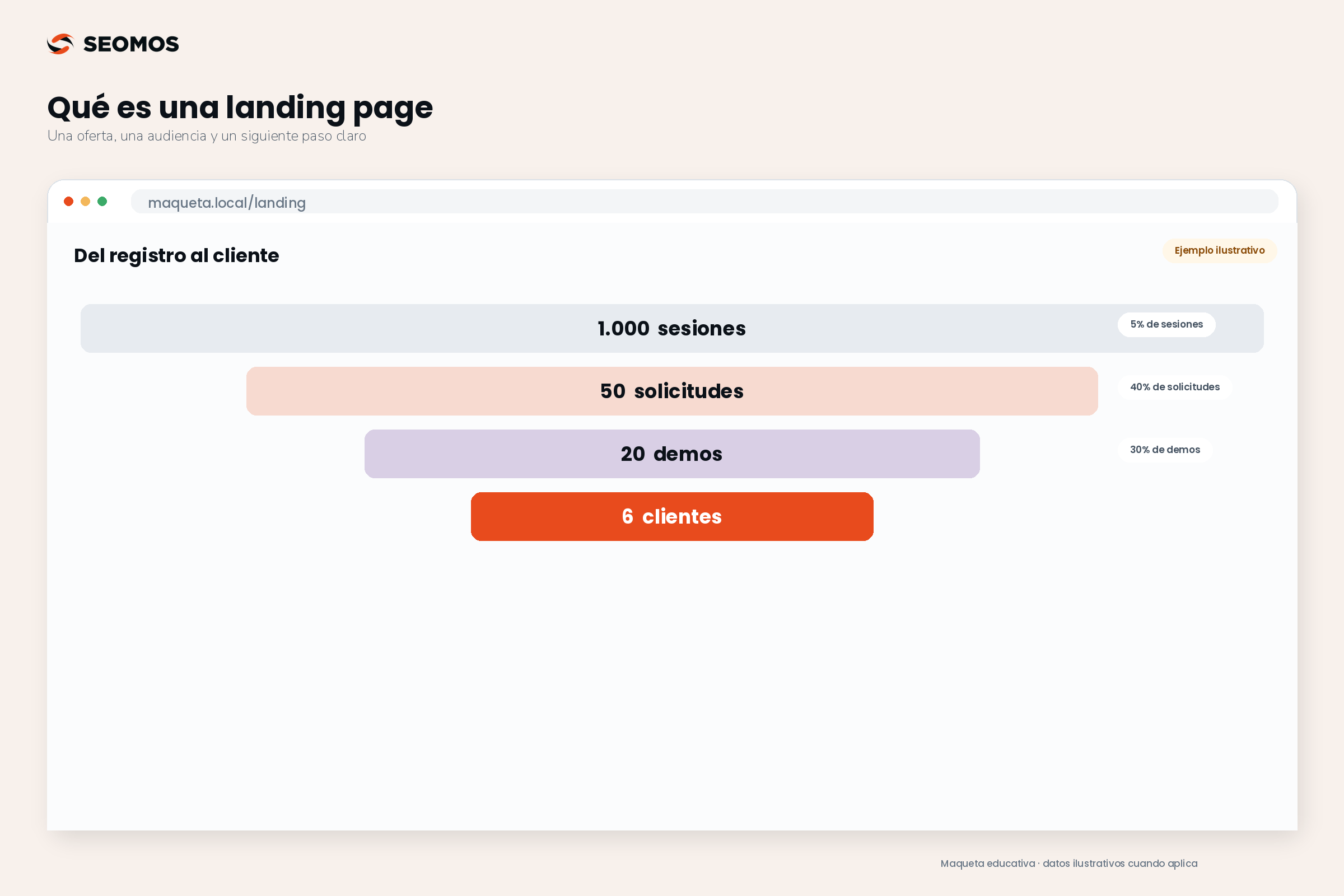
- Define the decision. Document audience, origin of visit, offer and main action.
- Write the plot summary. Organize proposal, scope, evidence, objections, and next step before choosing a template.
- Prepare the route. Connect form, confirmation and sales representative; decide what to do with duplicates and errors.
- Configure the measurement. Decide what will count as a valid contact and how it will be verified.
- Review and improve. Test devices, links, and data; then compare concrete hypotheses with results.
Before driving traffic, ask someone unfamiliar with the campaign to explain what the page offers, who it's for, and what will happen when the button is clicked. Their response helps identify ambiguities; it doesn't replace an experiment, but it prevents wasting budget on incomprehensible messages.
Example of a landing page: a software demonstration
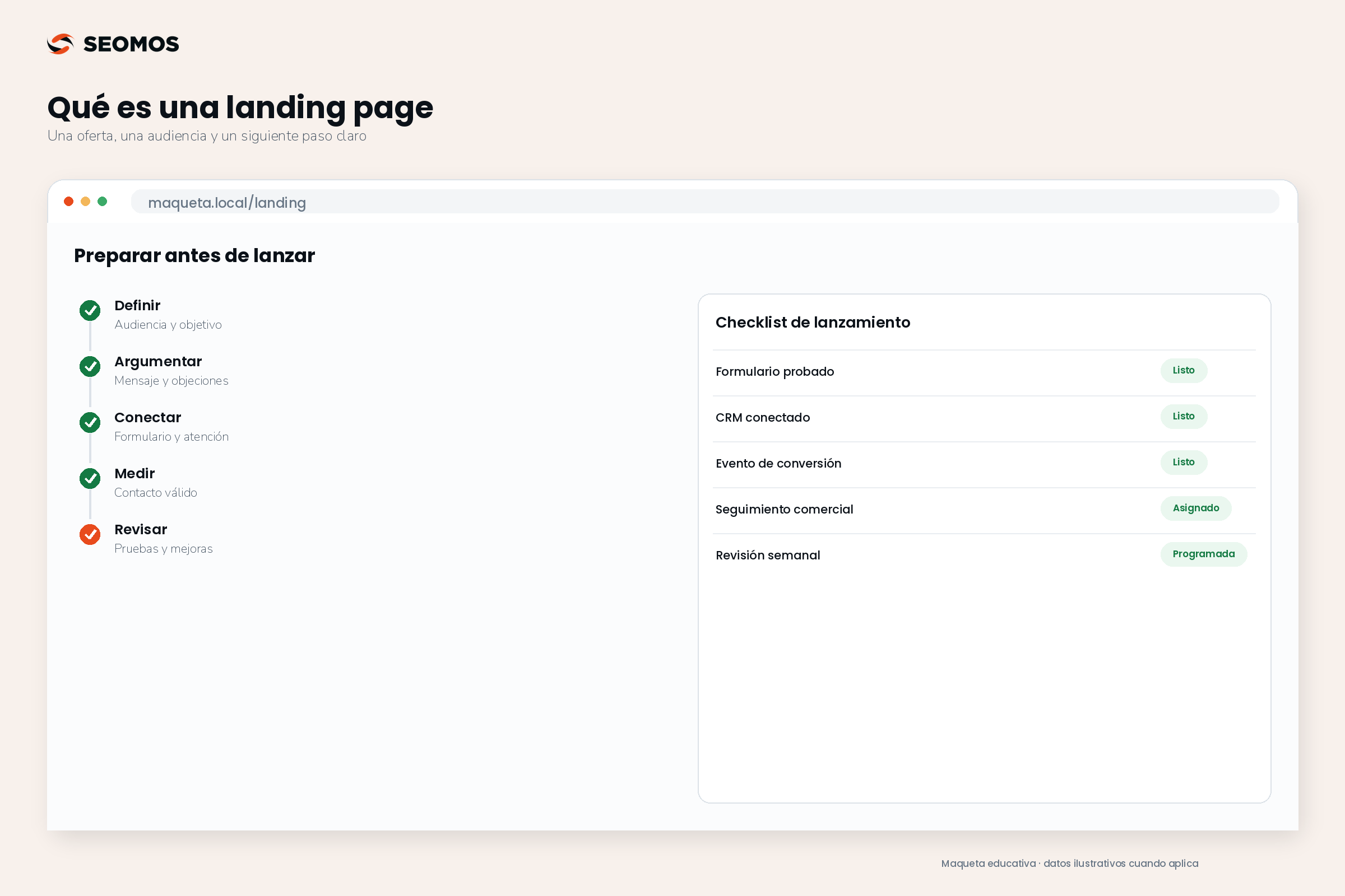
Hypothetical example, with illustrative figures: Aula Ordenada, a fictional software company for academies, is seeking demo requests. The ad mentions organizing reservations and class sizes. The landing page addresses this same issue, clarifies what the demo includes, and asks for the academy's name, email address, and approximate size. It makes no promises of savings or results it hasn't yet measured.
The main action is "Request a demo." After submission, a confirmation message explains the coordination process. The team records whether each request is valid and whether the person attends. This allows them to distinguish between the ease of filling out the form and the business benefit of the contact.
| Fact | Calculation | Interpretation |
|---|---|---|
| 1,000 sessions | Sessions measured on the landing page | Base chosen to evaluate the route. |
| 50 valid applications | 50 ÷ 1,000 × 100 = 5 % | Application fee valid per session. |
| 20 demonstrations performed | 20 ÷ 50 × 100 = 40 % | Progress from valid application to demonstration. |
| 6 clients | 6 ÷ 20 × 100 = 30 % | Closure among those who attended, within the defined follow-up. |
These figures are not industry benchmarks. If a variant receives 80 applications but only 12 demos, simply celebrating the form isn't enough. Review quality, responsiveness, and development timelines before choosing a winner. To help you make that decision, select a KPI linked to the business objective.
What to measure and how to avoid fake conversions
Document the unit of analysis: users, sessions, or clicks. Don't change the denominator between versions. In a session-based metric, decide whether to count converting sessions or the number of events; a single session could submit multiple forms. Exclude tests, spam, and duplicates using reproducible criteria.
In GA4, generate_lead This is a recommended event for recording the generation of a contact. Configure it to occur when the system confirms the request, not just when someone clicks the button. Receiving a contact and converting them into a customer are separate events. Source: Recommended events from Google Analytics.
Do not send names, emails, or phone numbers as event parameters or within the confirmation URL. Google restricts personally identifiable information in Analytics. Source: Analytics privacy practices. The configuration of permissions and consent should be reviewed according to the market and specific use.
To test changes, write a hypothesis and a primary metric before you begin. Keep the traffic source and offer comparable. With few conversions, an initial difference may be due to chance; don't declare a variant a winner just because you see one favorable day. If you're working with sales campaigns, link the page to the ROAS and its limits, without confusing attributed income with profit.
SEO and performance: what to check depending on the objective
A landing page can attract organic traffic if it answers a specific search intent and offers useful content. Use a descriptive title, consistent headings, relevant links, and a stable URL. If a page already exists that addresses the same intent, consider improving it before creating a competitor within your site.
A temporary campaign page or test variant may require a different indexing decision. Do not apply noindex by default to all landing pages. When used to exclude a page from Google, the crawler must be able to access it to read the instruction; block it in robots.txt It does not achieve the same. Source: Google documentation on noindex.
Also check loading speed, interaction responsiveness, and visual stability. These are the dimensions measured by LCP, INP, and CLS in the Core Web Vitals. Good technical measurement helps identify points of friction, but it doesn't necessarily prove that the offer is attractive. Source: Web Vitals. Prioritize problems observed on real devices, not added animations to decorate the journey.
Common mistakes and pre-launch review
The most costly mistakes often lie in the connection between elements: advertising something different, hiding terms and conditions, recording clicks as leads, or not having anyone to respond. Another pitfall is copying someone else's landing page without knowing their audience, traffic sources, or actual results.
- The promise in the advertisement matches the offer and its conditions.
- There is a main action that is visible and understandable on mobile.
- The evidence is real and the hypothetical examples are identified.
- The form saves the contact and displays useful errors.
- The measurement distinguishes between valid contact, opportunity, and customer.
- There is a person responsible for monitoring and an indexing decision.
Once the flow is defined, the marketing automation It can help coordinate some tasks. If you need to connect proposals, forms, and measurements, you can review the approach of SEOMOS web development o check the scope of your project.
Frequently asked questions about landing pages
What is the structure of a landing page?
Start with a clear proposal for a specific audience, explain the offer and its terms, provide evidence, answer questions, and end with a key action and an explicit next step. The form should only ask for the necessary information, and the confirmation should clearly indicate what happens next. Adjust the order and level of detail to the visitor's purpose.
Is a landing page the same as a web page?
A landing page is a web page with a specific function within a customer journey. It can be part of the company website, use an existing service page, or have a URL specific to a campaign.
Should a landing page have only one button?
It should have a clear main action, but you can repeat the button in different sections. Links that allow users to check terms, company identity, or privacy policies may also be necessary.
How many fields should the form have?
There is no single number. Request the necessary information to fulfill the request and proceed to the next step. Evaluate the number of records, quality, and effort involved.
What is a good conversion rate?
It depends on the offer, the channel, the audience, and what you count as a conversion. Compare periods and variations with equivalent definitions; a high rate of useless registrations does not indicate commercial success.
Can a landing page rank on Google?
Yes, if it's searchable and fulfills a user's intent with useful content. That doesn't guarantee visibility. Temporary variations and pages that duplicate another user's intent require a specific editorial and technical decision.
Is a short or long landing page better?
The proposal should address the questions necessary for a decision. A simple offer requires less explanation than a complex contract. Organize the information for easy exploration and test changes based on a hypothesis.
Sources consulted
Editorial consultation: August 31, 2026. The processes, criteria and hypothetical examples in this guide are original work.