

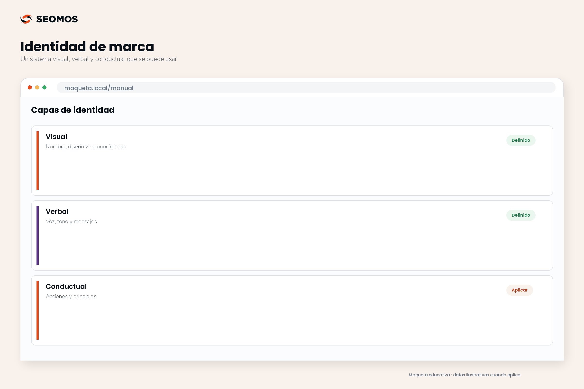
Brand identity is the system of elements and rules with which a company presents and expresses itself. It includes a name, language, design, and behavioral guidelines. Its function is to allow people to recognize it and receive consistent signals across different channels. Building it requires defining how it will be applied in real-world situations, not just approving a logo and a color palette.
What is brand identity and what is not
Identity encompasses decisions a company can make: how it brands its products, how it explains an offer, what visual resources it uses, and how it responds to certain situations. Brand image, on the other hand, is the perception people form. Both are related, but not identical: you can design a friendly communication style and still be perceived as distant if contact is difficult.
In this guide, we will explore identity in three layers: visual, verbal, and behavioral. It is a practical perspective compatible with the analysis of Nielsen Norman Group on brand and experience, which includes appearance, tone, and actions. What's relevant for a team is being able to translate each layer into rules, examples, and review criteria.
Identity is part of branding, But it doesn't replace your strategy. Before designing, you need to know what you're offering, to whom, and under what promise. Nor should you intuitively decide what position you want to occupy compared to other options: that decision belongs to the [unclear - possibly "the person"]. brand positioning.
| Concept | Scope | Example of work |
|---|---|---|
| Brand identity | System through which a brand presents itself and acts. | Language, design, and application rules. |
| Visual identity | Graphic components and their relationships. | Logo, color, typography, images and composition. |
| Corporate identity | Identity of the organization as a whole. | How he/she presents himself/herself to clients, team, and other audiences. |
| Brand image | Perception that exists in an audience. | Whether they consider it clear, confusing, accessible, or distant. |
The terms are used differently in the marketplace. In a contract or project, specify the deliverables rather than relying on the "full identity" label. A company may have a corporate brand and several product brands; not all of them need to share the exact same resources or tone.
Elements that a brand identity should include
Name and signature system
Define the primary name, its spelling, permitted abbreviations, and how it relates to products or services. Clarify when to use the legal name and when to use the trade name. If each department creates variations, the public may think they are dealing with different companies. Consistency begins with proposals, invoices, profiles, and confirmation messages.
The availability of a domain does not prove that you can protect or use a trademark without conflicts. WIPO explains that certain identifying elements can receive protection as trademarks. Legal review is independent of the design: commission it when appropriate and avoid treating a quick search as final authorization.
Verbal identity: voice, tone, and vocabulary
The voice reflects relatively stable expressive traits. The tone adapts to the situation: a welcome allows for enthusiasm; a payment error demands clarity and care. Describe these traits with examples, not just adjectives. “Practical” might mean explaining the next step before introducing technical terms; “approachable” doesn’t require using jokes or diminutives.
Atlassian incorporates voice, tone, language, and terminology into its design system. This example shows that writing can be managed with shared rules. For your company, prepare approved messages, words that require explanation, criteria for calls to action, and responses to sensitive situations. You don't need to copy another organization's style.
Visual identity: resources and relationships
In addition to the logo, document typography, colors, hierarchy, composition, photography, illustrations, and icons. The relationship between elements is as important as each individual resource: two pieces can use the same orange and still appear incompatible due to their imagery, proportions, or editorial tone. Define recurring design choices and leave room to adapt the format.
A visual system also needs alternatives. It should account for light and dark backgrounds, small sizes, monochrome reproduction, and situations where a suitable photograph is unavailable. Each alternative must address a specific need. Creating many versions without specifying when to use them increases the likelihood of errors and slows down production.
Behavioral identity: principles that can be observed
Translate personality into actions. If the brand wants to be transparent, it displays relevant terms and conditions before someone completes a purchase. If it wants to be attentive, it explains how it corrects errors or handles issues. Don't turn these principles into promises of timelines, guarantees, or availability that the business cannot yet deliver.
How to build an identity that the team can use
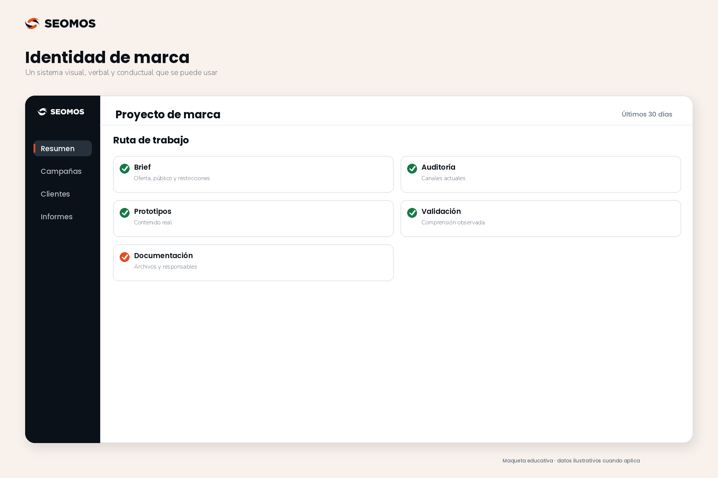
Design the brand identity It's not simply about choosing a logo. First, you define what the audience needs to recognize and understand; then, you translate those decisions into a name, language, visual resources, and application guidelines. Development is complete when the team can use that system across the web, in proposals, and in customer service without having to create a different version for each channel. The next step is to commission the design and evaluate its deliverables.
1. Prepare a brief with previous decisions
Include the offer, target audience, use case, desired features, available evidence, and constraints. Explain which current elements should be retained and why. “We want something modern” isn't a sufficient criterion; “the proposal must be readable on a phone during a sales visit” does guide decisions. Add the formats you'll actually need in the coming months.
2. Audit for inconsistencies before creating parts
Review a representative selection of channels: website homepage, form, social media post, ad, email, and proposal. Categorize issues by name, message, design, or behavior. This helps differentiate system failures from isolated errors. Don't redesign a working resource simply because another team doesn't have access to the correct file.
3. Test complete identity paths
Compare proposals in the same scenarios. Seeing one logo on an ideal wall and another on a standard document creates an unfair comparison. Request equivalent applications with real text and similar amounts of information. Evaluate legibility, recognition, consistency with the product or service, and adaptability. Personal taste can be part of the discussion, but it shouldn't be the only criterion.
4. Validate with specific tasks and questions
Ask members of the audience to explain what the company offers or to identify a relevant condition. Ask which items appear to belong to the same brand and why. An exploratory interview helps uncover problems, not automatically calculate a representative preference. Record observations and changes; "it was very well-liked" is less useful than understanding what was misunderstood or confused.
5. Document, deliver, and assign maintenance
Publish an official version of the system with correct examples, common errors, and editable files where applicable. Define who authorizes changes and how exceptions are requested. Maintain a brief version log so the team can easily identify what's current. If the manual relies on requesting each resource from a single person, adoption will be fragile.
What should an identity manual include?
| Block | Minimum content | How to check it |
|---|---|---|
| Name and signature | Writing, versions, relationship between brands and uses. | The team signs both a proposal and a profile. |
| Visual system | Logo, color, typography, images and composition. | It works in the intended formats, including mobile. |
| Verbal system | Features, examples, vocabulary and tone by situation. | Two people write compatible messages. |
| Applications | Templates of priority materials. | They can be edited without breaking the essential rules. |
| Use and maintenance | Files, licenses, responsible party and current version. | The correct resource is located without rebuilding it. |
The scope of the guidelines should reflect the complexity. A business with few formats might need a brief guide and clear examples. An organization with different teams, products, and languages requires more rules. Ensure that font and image licenses cover intended uses; receiving a file does not grant full usage rights.
Example of brand identity: a system for an educational service
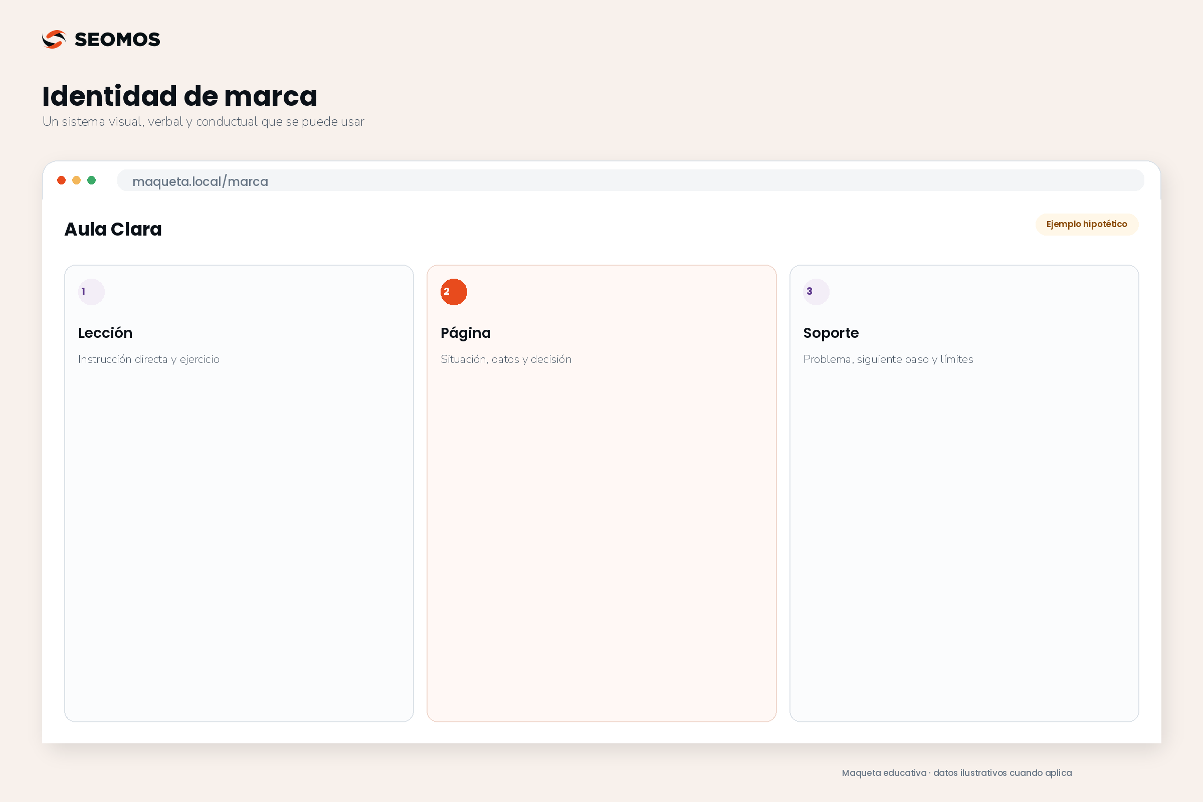
Hypothetical example: Aula Clara is a fictional, practical training service for small businesses. Its mission is to explain concepts and help apply them through exercises. The brand identity should clearly reflect this approach without promising financial results or presenting participants as experts after just one session.
In terms of communication, the team chooses a direct and explanatory style. One instruction reads, “Complete this calculation with your business data,” instead of “Unlock your full potential.” In an incident report, the message identifies the problem and offers an available next step; it doesn't maintain promotional enthusiasm when the person needs help.
Visually, the examples use a stable structure: situation, data, and decision. Colors differentiate functions, but labels also indicate the meaning of each block. The photographs show learning-related contexts; they do not attempt to simulate real facilities or participants. The brand symbol accompanies the materials without competing with the instructions.
In terms of behavior, each exercise explains its assumptions and limitations. If a calculation is hypothetical, it is clearly indicated. When a response requires information the team lacks, this limitation is acknowledged. Identity thus becomes a way of teaching and responding, in addition to an appearance. To test it, the team reviews a webpage, a worksheet, and a support message.
Digital identity: accessibility and adaptation without losing consistency
Brand colors should not impede the reading of instructions or the distinction of interface states. W3C WCAG guidelines on minimum contrast For this AA level criterion, they establish ratios of 4.5:1 for normal text and 3:1 for large text, with the conditions and exceptions described in the standard. The logo exception does not extend to all the text on a page because it is corporate.
Prepare specific color combinations for interfaces instead of requiring all text to use the lightest color in the palette. Test forms, links, buttons, and notices with real content. Maintaining a recognizable identity allows for these adaptations; consistency doesn't mean every piece has to have identical proportions or the exact same layout.
To the create a website, It delivers the rules along with components and interaction examples. A system of UX/UI design Connect brand decisions with screens that people can understand and use. An isolated color file doesn't define how an error is reported or how the main action is distinguished.
On social media, adapt density, duration, and hierarchy to the format. An educational carousel doesn't need to look like an advertisement, even though both share recognizable cues. When planning content and SEO for social media, It maintains clarity in names, themes, and messages; an original personality does not justify hiding what a publication is about.
How to assess if identity works
He Ehrenberg-Bass Institute It proposes evaluating distinctive assets based on their recognition and association with a specific brand. Therefore, an attractive template can work as a design element but fail as a brand identity marker if people attribute it to a competitor. The evaluation depends on the target audience and the context of exposure.
Combine that observation with operational metrics: how many pieces need correction, how long it takes the team to find files, and which messages generate recurring questions. Record an initial benchmark and review comparable materials. If you convert those metrics into KPI, Define objective, responsible party and associated decision; the number of templates produced does not in itself demonstrate a better identity.
Before approving a submission, check that the name is consistent, the files are usable, the applications are readable, and the verbal examples cover real-world situations. Also, verify that there is a designated system owner. These points usually add more value than increasing the number of pages in the manual without addressing its gaps.
Frequently asked questions about brand identity
What does brand identity design include?
It includes a brand and audience analysis, positioning and expression decisions, and an implementable system. Depending on the agreed scope, deliverables may include logo, color, typography, voice, templates, and a style guide. Request examples from your actual channels and acceptance criteria: receiving files without usage guidelines does not ensure brand consistency.
What elements make up brand identity?
Name, visual resources, language, and behavioral guidelines, along with rules for applying them. The system typically includes logo, typography, colors, images, messages, tone, and examples. Its scope depends on the company's channels and needs; there is no universal number of elements that makes it complete.
Are visual identity and corporate identity the same thing?
Not necessarily. Visual identity focuses on graphic resources. Corporate identity can encompass how the organization presents itself and behaves with different audiences. Since these terms are used with varying scopes, it's advisable to agree on deliverables and acceptance criteria before starting a project.
Is it possible to improve the brand identity without changing the logo?
Yes. You can organize fonts, layouts, messaging, templates, and usage guidelines while maintaining a recognizable brand. First, identify what's going wrong. If the problem is inconsistent application or confusing communication, replacing the logo might add work without addressing the root cause.
What is the difference between brand voice and brand tone?
The voice expresses stable personality traits; the tone adapts them to a situation. A clear and approachable brand can celebrate an achievement with enthusiasm and explain an incident in a measured way. Maintaining a consistent voice doesn't mean writing the same thing in a promotion, an invoice, and an apology.
How many colors and fonts does a brand need?
The necessary tools to solve your applications without making them difficult to maintain. The key is to assign functions, hierarchies, and readable combinations. An extensive palette doesn't guarantee flexibility, and a minimal one may fall short; test the system on the web, in documents, and in other formats before finalizing it.
Does a coherent identity require repeating all the pieces?
No. Consistency means maintaining recognizable criteria while changing content and context. You can vary composition, images, or tone depending on the task. The style guide should indicate what remains constant and what can be adapted, so the brand is identifiable without turning every communication into the same template.
Sources consulted
Editorial consultation: 31-08-2026. The process, tables and Aula Clara are original work; the case is hypothetical and does not represent a client or a result of SEOMOS.