

A store can receive traffic, display an attractive catalog, and still lose sales because the size information is unclear, the price changes at the end, the main button is easily missed, or the form requires too much information. These problems aren't just visual: they affect user trust and force them to put in extra effort to make a purchase.
That's why the online store design It should begin with the shopping journey. Each screen answers a question: Am I in the right place? How do I find the product? Is it right for me? How much will it cost? When will it arrive? Can I return it? Is it safe to buy here?
Below you'll find twelve elements that help answer these questions and build a clearer, more measurable experience ready for growth. Then we'll see how to turn them into an e-commerce project, what the service should include, and when it's best to create, redesign, or optimize an existing store.
1. A value proposition that is quickly understood
The header and first section should explain what the store sells, who it sells to, and what sets it apart. Avoid generic phrases that could apply to any brand. If the value lies in fast delivery, local manufacturing, specialization, customization, or a warranty, communicate it clearly and precisely.
The ad doesn't have to take up the entire screen. It should guide and direct traffic to a category, collection, or product. Temporary promotions work best when they aren't competing with five other messages at the same time.
2. Architecture and navigation based on how people shop
Organize categories according to customer vocabulary and preferences, not the internal inventory structure. A person might search by product type, use, recipient, size, style, or problem. Navigation should reflect the most frequent paths and allow users to go back without losing context.
Avoid endless menus and categories with ambiguous names. If the catalog is large, use clear levels, breadcrumbs, and category pages with brief introductions. Internal links also help searchers and users understand relationships between collections, guides, and products.
Design the internal linking of categories and products According to this process: a selection guide can lead to the relevant category, and a product page can offer compatible accessories when available. Avoid linking to the entire catalog from each page; each recommendation should address a genuine need of the buyer.
3. Tolerant and useful internal search
The search is critical when the user knows the product, reference, or need. It must recognize synonyms, common errors, singular and plural. The results need images, price, availability, and relevant filters, not just a list of titles.
Analyze searches that yield no results. These will show keywords used by customers, products in demand, and naming issues. An empty search should offer corrections, categories, or help, not a dead end.
4. Categories with filters that actually narrow down the options
The filters should correspond to attributes that influence the purchase: size, compatibility, material, price, availability, color, capacity, or use. Display clear and understandable options and allow users to easily remove each selection.
On mobile, filters need visible access, a summary of selections, and a clear button to apply or view results. They should retain the user's state when entering and returning to a product. Forcing users to repeat filters disrupts the browsing experience.

5. Complete and compelling product descriptions
The product page is where many people decide to buy or abandon their purchase. Baymard has documented over a thousand usability problems related to product pages and notes that only a portion of the e-commerce sites evaluated achieve good or decent performance. Product Page UX research It shows the importance of treating this template as the center of the experience.
A solid profile includes:
- Specific and easy to scan title.
- Clear gallery with close-ups, context, and real variations.
- Price, currency, taxes and discounts are understandable.
- Availability and estimated delivery time.
- Variants with clear states and selection guide.
- Benefits, specifications and compatibility.
- Exchange, warranty and return policies.
- Verifiable reviews where available.
- Visible main button and a clear back message.
Google Merchant Center also requires that the landing page title, image, price, currency, and availability match the submitted data. See their requirements for product pages. Consistency prevents surprises and protects free campaigns and listings.
6. Photography and video that reduce uncertainty
The images should answer questions that the user cannot physically resolve: scale, texture, finish, use, packaging, and details. Maintain a consistent aspect ratio throughout the catalog to avoid visual jumps, but allow the user to see the entire product and zoom in.
Video works best when it demonstrates movement, installation, or results. Don't play it with unexpected sound or make it a loading bottleneck. Optimize formats, sizes, and lazy loading to maintain quality without compromising performance.
7. Transparent pricing, costs, and promotions
Show the final price or clearly explain what may vary. Shipping costs, taxes, minimums, and promotional conditions shouldn't appear unexpectedly in the final step. If you calculate shipping based on location, allow users to estimate it before checkout.
A promotion needs a valid date, included products, and verifiable conditions. Avoid resettable timers, permanent discounts presented as urgent, or crossed-out prices without any real basis. Artificial pressure might get a click but lose trust.
8. Signs of trust located where doubt arises
Trust isn't built by piling up generic seals in the footer. Display contact information, company identity, payment methods, data policy, shipping terms, returns, and support in an easily accessible way.
Place each answer near the related decision: delivery next to the product, returns near the purchase button, security, and total at checkout. Reviews should be credible, provide context, and not hide legitimate criticism.
9. Persistent, editable, and predictable shopping cart
The shopping cart should retain items throughout the session, display the correct variations, and allow users to change quantities or remove items without reloading the entire experience. After adding an item, it should confirm the action and offer options to continue shopping or go to the cart.
Display the subtotal, discounts, estimated shipping, and total clearly labeled. Recommended products should not obscure the summary or confuse the next step. If inventory changes, explain what happened and how to resolve it.
10. Short, linear, and accessible checkout
It allows guest checkout and prevents account creation from becoming a barrier. It only requests necessary information, uses visible labels, retains valid data when an error occurs, and explains how to correct each field.
Google recommends secure checkout, consistent availability, stable currency, and responsible data collection in its checkout requirements and best practices. The W3C forms guide agrees that simple, labeled forms with clear instructions benefit everyone.
The flow should feel linear even if it has several steps. It shows progress, allows users to review their order, and avoids ambiguous actions. The final button needs to indicate that the purchase will be made, not simply "continue.".

11. Mobile performance and experience
The store must load quickly on real mobile networks. Compress images, reserve their dimensions, limit third-party scripts, optimize fonts, and avoid apps that inject duplicate functions. Measure category, product, cart, and checkout pages; the homepage doesn't represent the entire user journey.
Core Web Vitals evaluate load, interaction, and stability. Google recommends LCP of 2.5 seconds or less, INP of 200 milliseconds or less, and CLS of 0.1 or less for the majority of visits. These goals improve the user experience, but they don't replace a relevant offer or a clear sales process.
On mobile, check buttons, variant selectors, keyboards, autocomplete, payment methods, and error messages. A responsive store isn't just a scaled-down version of the desktop version; it reorganizes information based on the touch context.
12. Measurement, experimentation and continuous improvement
Configure events from discovery to purchase: list view, search, product view, variant selection, add to cart, checkout, payment, and purchase. Validate that values, currencies, and identifiers are correctly sent to analytics and the catalog.
Segment by device, channel, category, and stage. A drop in conversion can stem from low-quality traffic, availability, costs, slowness, or payment errors. Don't redesign everything based on an aggregate metric: pinpoint the friction.
Prioritize testing with hypotheses and controlled risk. Changing the color of a button rarely corrects incomplete information, while clarifying delivery, size, or return policies can address a genuine objection. Document each experiment to avoid repeating decisions.
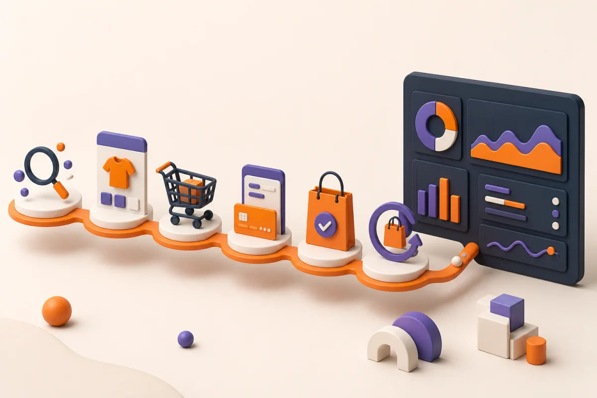
How to connect these elements into a single route
- The proposal points towards relevant categories.
- Navigation, search, and filters reduce the catalog.
- The information sheet answers questions and allows you to choose a variant.
- The shopping cart confirms selection, costs, and availability.
- The checkout process asks for the bare minimum and conveys control.
- The confirmation explains payment, delivery, and support.
- Analytics reveals where to improve the process.
Each stage must maintain the previous promise. If a campaign advertises free shipping, the product page, shopping cart, and checkout must reflect the same condition. If a variant is out of stock, that information must match across the catalog, landing page, feed, and checkout.
SEO for an online store
Ecommerce design and SEO intersect in architecture, content, performance, and data. Create stable URLs, useful categories, original product listings, internal links, and structured product data when the information is accurate and readily available.
Control filters and combinations to avoid thousands of irrelevant URLs. Maintain your sitemap, canonical tags, inventory, and redirects. Category pages can address broad search intent; product listings, specific searches; and guides, questions that accompany the decision-making process.
An integrated strategy connects the store with content such as our guide on How to create a website and with a service of SEO in Colombia that measures visibility and sales, not just rankings.
Create a new store, redesign, or start by optimizing?
Not all businesses need to replace their e-commerce platform. The right decision depends on the technical state of the system, the available data, and the extent of the friction points. Redesigning everything without identifying the problem can consume budget and eliminate elements that were already working.
Create a store from scratch
This is appropriate when the brand doesn't yet sell online, the current channel relies on manual processes, or the existing platform can't handle the necessary catalog, payments, shipping, and integrations. The project must define, from the outset, operations, content, technology, user experience, acquisition, and measurement.
Before designing screens, document how products, pricing, stock, orders, returns, and customer service will be managed. A promising shopping experience can fail if the team doesn't have a sustainable process in place to deliver it.
Redesigning an existing store
A redesign makes sense when the architecture no longer accurately reflects the product catalog, the interface limits growth, the platform creates excessive dependencies, or the user journey requires structural changes. It also makes sense when a technology migration is necessary due to integrations, operating costs, security, or manageability.
In this scenario, it's essential to preserve assets: URLs that receive traffic, product data, customer data, order data, analytics, feeds, automations, and business configurations. The launch requires redirects, catalog validations, and purchase testing; it's not just about changing the appearance.
Optimize before redesigning
If the store is technically functioning and already receiving traffic, it might be better to address the stages with the highest losses. A funnel audit can reveal that the problem lies in filters, delivery information, variant selection, mobile errors, or a payment method.
Phased optimizations reduce risk and allow for impact measurement. First, obvious errors and friction points are corrected; then, improvements to navigation, product, shopping cart, or checkout are validated. This approach is especially useful when the business cannot halt operations for a large-scale migration.
Shopify or WooCommerce: Which platform is right for you?
Both can support professional e-commerce, but they operate under different business models. The choice should consider catalog, equipment, integrations, customization, markets, recurring costs, and maintenance; not just vendor preference.
- Shopify: It consolidates infrastructure, administration, and business functions into a managed environment. It may be suitable for teams that prioritize streamlined operations and an integrated ecommerce ecosystem.
- WooCommerce: It extends WordPress and offers extensive control over content, structure, and customization. It can be a good fit when the site combines a strong editorial strategy with specific business needs.
In either case, you need to review applications, extensions, payment gateways, shipping carriers, billing, inventory, analytics, and markets. A platform alone cannot solve the architecture, product listings, checkout process, or conversion strategy.
At SEOMOS, we work with Shopify and WooCommerce. We recommend the option based on the project's operations and objectives, avoiding adding unnecessary technical complexity to the business.
What does a professional online store project include?
The scope must connect design with operation. A store isn't finished just because the homepage and a product listing look good; it must function from discovery to confirmation and empower the team to manage the channel.
- Commercial discovery: business model, markets, catalog, customers, promotions, logistics and objectives.
- Ecommerce architecture: categories, filters, search, navigation, support content, and relationships between products.
- UX/UI: routes, wireframes, responsive design, components, empty states, errors, and accessibility.
- Configuration or development: theme, catalog, variants, cart, checkout and agreed functionalities.
- Integrations: payments, shipping, analytics, CRM, inventory, billing or automations when they are part of the project.
- Technical SEO: URLs, categories, listings, structured data, indexing, filters, canonicals, and redirects if there is a migration.
- Measurement: ecommerce events, values, currencies, product identifiers, and funnel validation.
- QA: product testing, promotions, taxes, shipping, payment, notifications, and mobile behavior.
- Launch and support: controlled publication, monitoring, training, and maintenance plan.
Deliverables vary depending on the store and must be documented in the proposal. For example, photo production, mass creation of product descriptions, complete catalog upload, or integrations with enterprise systems may require specific phases and responsible parties.
How much does it cost to design and develop an online store?
There is no responsible pricing without understanding the scope. The number of products is a factor, but it's not the only variable: two stores with one hundred SKUs can have very different levels of complexity if one uses simple variations and the other combines customization, shipping rules, multiple currencies, inventory management, or integrations.
The investment usually depends on:
- Platform and need for customization.
- Number of templates and different routes.
- Catalog volume, quality, and data migration.
- Pricing rules, promotions, taxes and markets.
- Payment methods, shipping and logistics operators.
- Integrations with inventory, billing, CRM or ERP.
- Research, copywriting, photography, and content production.
- SEO migration, redirects, and data retention.
- Analytics, advertising feeds, and automation.
- Maintenance, support and subsequent evolution.
Request a proposal that itemizes configuration, design, development, content, licenses, applications, and recurring costs. It should also specify what tests will be performed and what information your company needs to provide. Comparing only the total cost can mask significant differences in quality and accountability.
How SEOMOS works on an ecommerce project
We start with the business objective and the actual operation. We define the scope and technology, design the journey, develop or configure the store, and validate each stage before launching. The process integrates the capabilities of UX/UI design y web development to prevent the strategy from being lost when moving from prototype to implementation.
1. Discovery and Scope
We review objectives, catalog, current platform, operations, users, integrations, and priorities. If the store already exists, we analyze the user journey and available data to decide whether it's best to optimize, redesign, or migrate.
2. Architecture and experience
We organize categories, navigation, search, product pages, shopping cart, and checkout. We work on wireframes and responsive visual design, taking into account variations, promotions, inventory status, errors, and confirmation messages.
3. Development and integrations
We implement the solution on Shopify or WooCommerce depending on the scope. We configure the agreed-upon features and connect the necessary tools, ensuring the team can manage the catalog and content.
4. SEO, analytics and quality control
We prepared the technical infrastructure, implemented the sales funnel, and tested purchases in real-world scenarios. We reviewed mobile performance, payments, shipping, emails, data, and error recovery before launch.
5. Launch and improvement
We publish in a controlled manner, monitor performance, and provide a support and optimization roadmap. A store must evolve with its catalog, campaigns, logistics, and customer behavior.
Common mistakes in online store design
- Prioritize animations over clarity and performance.
- Use internal categories that the customer does not recognize.
- Displaying small or inconsistent photos.
- Hide shipping, taxes, or returns until the end.
- Require users to create an account before purchasing.
- Requesting unnecessary information at checkout.
- Installing too many tracking applications and scripts.
- Design the flow only on desktop.
- Measure only the purchase and miss intermediate signals.
- Publish changes without testing inventory, payments, and notifications.
Checklist before launching the store
- Products, variants, prices and stock are correct.
- Policies and contact information are easy to find.
- The search and filters work with the actual catalog.
- The shopping cart stores products and calculates totals correctly.
- The checkout works as a guest and from a mobile device.
- Payment and shipping methods were tested end-to-end.
- The confirmation emails contain correct information.
- Analytics and catalog receive valid events and values.
- SEO, structured data, sitemap and redirects have been reviewed.
- There is a backup and a rollback procedure.
Frequently asked questions about online store design
What should the design of an online store include?
It must integrate a clear proposal, navigation, search, filters, complete listings, trust, shopping cart, secure checkout, mobile experience, performance, accessibility, and analytics.
Which page has the most influence on the purchase?
The product page is often crucial because it includes images, price, variations, benefits, availability, and terms and conditions. However, the sale depends on the consistency of the entire customer journey.
Is it advisable to force the customer to create an account?
It's generally better to allow guest checkout and offer an account later or as an option. If registration is required, it should be free, quick, and not require changing devices.
How to improve a store's conversion rate?
Analyze the funnel, identify friction points, and prioritize hypotheses. Improving product information, costs, delivery, performance, and checkout is often more effective than making isolated visual changes.
Should an online store be designed for mobile first?
Yes, it's advisable to start with mobile restrictions and validate desktop as well. The touch interface requires adapted controls, filters, variations, forms, and payment methods, not just a reduction in size.
What information builds trust?
Verifiable identity and contact information, consistent pricing and availability, delivery, returns, warranty, security, payment methods, and authentic reviews located near the decision point.
Does store design affect SEO?
Yes. Architecture, links, content, mobile performance, accessibility, filters, and structured data all influence how users and search engines find and understand the store.
Does SEOMOS design and develop online stores?
Yes. At SEOMOS, we create, redesign, and optimize e-commerce sites on Shopify and WooCommerce. Our services can include strategy, UX/UI, development, catalog management, payments, analytics, technical SEO, performance optimization, and support.
Can they improve an existing store without replacing it?
Yes. When the technological foundation remains adequate, we can analyze the funnel and optimize navigation, product pages, performance, shopping cart, or checkout in stages. If a migration is necessary, we first define how to preserve data, URLs, and integrations.
Conclusion
He online store design It should reduce uncertainty at every stage. An attractive interface adds value when it makes it easier to discover, compare, decide, pay, and receive support.
At SEOMOS, we connect strategy, UX/UI, development, analytics, and acquisition to build complete sales journeys. If you want to create, redesign, or optimize your e-commerce site, learn about our service. online store development or request an evaluation from contact.