

Web accessibility involves designing and developing websites, content, and tools so that people with different abilities can perceive, understand, navigate, and interact with them. WCAG 2.2 organizes criteria under four principles: perceivable, operable, understandable, and robust. Quality is assessed using tools and human review; no automated score alone demonstrates conformance.
Accessibility also benefits older people, mobile users, those with limited internet connections, and those experiencing temporary situations such as injury or a noisy environment. It must be integrated from research and design through development, content creation, and maintenance.
What is web accessibility?
This means that the website does not create avoidable barriers for people with visual, hearing, motor, cognitive, neurological, or speech disabilities. This includes reading, navigation, data entry, communication, and contribution.
It's not a special mode that activates at the end. A semantic structure, clear text, flexible controls, and compatibility with assistive technologies are all part of the core product.
What are WCAGs?
The Web Content Accessibility Guidelines are international recommendations from the W3C. WCAG 2.2 contains verifiable criteria at levels A, AA, and AAA, accompanied by understanding documents and techniques. Compliance requires reviewing the entire applicable set, not simply selecting convenient examples.
Techniques may evolve, and not all are mandatory if another solution meets the criteria. Always consult the official version and the legal requirements of the country and sector; this article does not replace legal advice.
The four principles of POUR
Perceptible: The information is presented in detectable ways. Operable: Controls and navigation can be used. Understandable: Content and behavior are clear. Robust: The code works with agents and assistance technologies.
A problem can affect several principles. A modal without focus is inoperable; if it also doesn't announce its name, compatibility fails as well. Investigate the entire path.

Images and alternative text
An informative image needs an equivalent that communicates its purpose. Alternative text depends on the context: a graphic summarizes the conclusion; a functional icon names the action; a decorative image can use empty alt text so the screen reader ignores it.
Don't describe every pixel or stuff with keywords. If the image contains complex information, explain the details in the surrounding text or an expanded description. Linked logos often communicate organization and purpose.
Headings, regions, and semantics
Use HTML according to meaning: headings for sections, lists for sets, tables for data, and buttons for actions. Regions like Header, Navigation, Main, and Footer make it easier to find what you're looking for. Don't use a div clickable when a native control exists.
The code order should make sense without styling. An H1 describes the page, and subsequent levels organize the content; don't choose H3 just for visual size.
Keyboard navigation
Every function must be operable without a mouse. Navigate using Tab and Shift+Tab, activate with expected keys, and test arrow keys where the pattern requires it. The focus must be visible, logical, and not get stuck.
Menus, modals, carousels, autocomplete, and editors require special attention. When you close a modal, focus should return to the control that opened it. A "skip to content" link prevents repeated navigation.

Color and contrast
WCAG defines minimum relationships based on element size and type. It checks text, informational icons, control borders, and focus states. The value depends on final colors, including transparency and background.
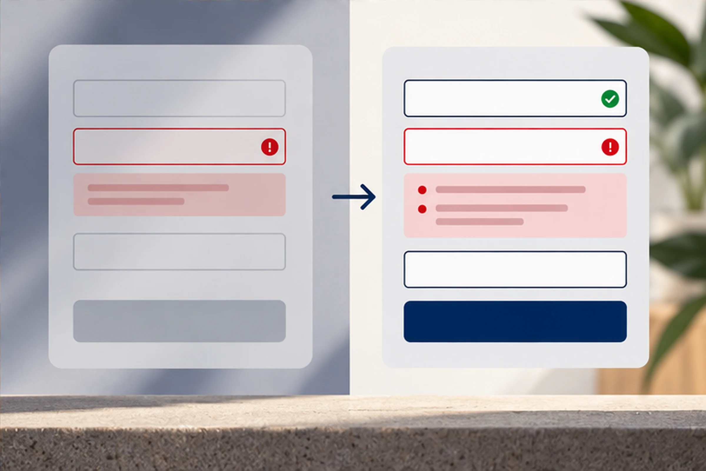
Don't use color as your only indicator. Add text, shapes, or icons: a bug can't be identified by red alone. Experiment with themes, hover effects, disabled options, and images with overlaid text.
Zoom, reflow, and responsive design
The content must support both zoom and narrow screens without losing information or requiring unnecessary two-dimensional scrolling. Avoid fixed heights, cropped text, and controls that overlap when spacing is increased.
Complex tables can be moved horizontally within a named container without breaking the entire page. This prioritizes readability and action over maintaining a rigid layout.
Forms and errors
Each field needs a persistent label; placeholders do not replace them. Explain formatting when necessary, and easily access help and required flags. Group related options. fieldset y legend.
When errors occur, it identifies areas, describes the problem, and suggests corrective actions. It provides a predictable focus or summary of errors and preserves valid information. In legal or financial decisions, it allows for review and correction.
Links, buttons, and target size
A link navigates; a button executes. The accessible name should express purpose, preferably from the visible text. Repeatedly saying "Click here" loses context. Maintain consistent identification for equivalent actions.
Touch targets need space and separation. WCAG 2.2 incorporates minimum size criteria with exceptions; review the normative text. Avoid drag-only actions when an alternative can be offered.
Audio, video and movement
It provides subtitles for spoken content and alternatives depending on the medium and level. Transcripts facilitate searching and reference; audio description communicates relevant visual information. Controls must be accessible.
Do not play unexpected audio. Allow motion to be paused and respect motion reduction preferences. Avoid flashes that may trigger reactions.
ARIA: when to use it
ARIA communicates name, role, status, and relationships when native HTML falls short. It does not automatically add interaction. An element with role="button"" It still needs keyboard, focus, and correct events.
Prefer native elements and documented patterns. Keep states like expanded, selected, or invalid synchronized with the interface. An outdated attribute can worsen the user experience.
Understandable content
State the language, use direct sentences, explain terms, and structure with descriptive headings. Clear reading doesn't mean oversimplifying; it means reducing ambiguity and helping readers find information.
Messages should anticipate consequences. A "Delete account" button is better than "Continue." Keep navigation and help in consistent locations.
Accessible Authentication
Avoid cognitive tests without alternatives. Allow password managers, code pasting, and compatible methods. WCAG 2.2 incorporates accessible authentication criteria; it evaluates the entire flow, including recovery and two-factor authentication.
Security and accessibility are not mutually exclusive. Design equivalent options and discuss risks with both teams.
How to assess accessibility
- Define scope, WCAG version, and target level.
- Select templates, states, and critical tasks.
- Run automated tools.
- Navigate using only the keyboard.
- Test zoom, reflow, and contrast.
- Use relevant screen readers.
- Review content and forms.
- Include users with disabilities where possible.
- Document evidence, impact, and correction.
W3C points out that no single tool determines accessibility. Automation finds patterns; expert review decides meaning and experience.
How to prioritize findings
Prioritize critical task blocks, scope by template, severity, frequency, and affected individuals. An impossible keyboard checkout takes precedence in urgency over an isolated warning on a secondary page.
Fix system components before instances. Define acceptance criteria and regression testing. Don't mark "resolved" just because the code changed; verify the process.
Relationship with SEO and conversion
Semantics, alternatives, titles, links, and user experience can aid comprehension and use, but accessibility isn't a ranking trick. Its goal is equitable access. It also doesn't guarantee conversion; it simply removes barriers that prevented task completion.
Evaluate results by segment carefully and do not use disability data for profiling without a legitimate reason. The service of UX/UI design It can integrate accessibility from components.
Governance and maintenance
Assign responsibilities to content, design, development, and QA. Add criteria to briefs, designs, code reviews, and definition of done. Keep components accessible and maintain usage documentation.
Conduct audits on every release and periodically thereafter. Train teams and provide an accessible channel for reporting barriers. Publishing a statement is not a substitute for solving problems.
Mobile accessibility and diverse entry points
Test orientation, zoom, mobile screen reader, target size, and gestures. Don't force device rotation or rely on complex movements. A drag action should have a simple alternative where applicable; a control should tolerate imprecise touch.
Keyboards are not the only input method. Voice, switches, styluses, and assistive technologies can all generate equivalent events. Avoid detecting capabilities from the device and removing functions; build controls that adhere to standards.
Accessibility in the design system
Document variations of buttons, links, fields, menus, modals, notifications, and tables, including keyboard behavior, name, role, status, and contrast. Include correct examples and prohibited uses. This prevents each team from having to solve the same problem repeatedly.
Color tokens can indicate approved combinations, but they must be tested in real-world contexts. An accessible component can become inaccessible by receiving an empty tag, incorrect order, or excessively long content. Define content contracts and automated tests.
Documents, emails, and downloadable content
The experience doesn't end with HTML. PDFs, spreadsheets, presentations, and emails need structure, reading order, contrast, alternatives, and clear links. If a process depends on an inaccessible document, the entire workflow remains barrierd.
Prioritize web formats when they facilitate adaptation and keep the archive as an alternative when necessary. Test readers and exports; a document that looks good may lose headings and tags during conversion.
Purchases and suppliers
It includes accessibility requirements for selection, contract, and acceptance. It requires evidence for each criterion and task, not a generic statement. It evaluates third-party components such as chat, payments, maps, reservations, and CAPTCHA because they can block the user experience even if the main site is working correctly.
Define what happens when a vendor fails to correct issues: an accessible alternative, a deadline, or a replacement. Maintain versions and changes. Responsibility for expertise does not disappear when an external service is brought in.
During a refresh, repeat critical tasks with the current version. An older report doesn't cover new interfaces or integrations. Log exceptions, impact, temporary compensation, responsible party, and commitment date; persistent exceptions tend to become forgotten barriers that are much more costly to fix later.
Common mistakes
- Relying solely on one score.
- Install an overlay as a complete solution.
- Remove the focus indicator.
- Using ARIA over incorrect HTML.
- Confusing placeholder with label.
- To depend solely on color.
- Publish video without alternatives.
- Correcting pages without a system.
Initial checklist
Test titles and language, hierarchy, landmarks, keyboard, focus, contrast, zoom, alternatives, forms, messages, multimedia, modals, and authentication. Do this in real templates and states, including error and no data.
To evaluate design and development you can contact SEOMOS. A serious diagnosis should state scope, standard, tools, and limitations.
Sources consulted
Documentation consulted on September 10, 2026.
- W3C WAI: Introduction to Web Accessibility.
- W3C WAI: Quick Reference WCAG 2.2.
- W3C WAI: Testing and Evaluation.
Frequently asked questions about web accessibility
What is web accessibility?
It is about designing and developing so that people with different abilities can perceive, understand, navigate and interact.
What does WCAG mean?
Web Content Accessibility Guidelines, W3C guidelines with verifiable accessibility criteria.
Does a tool confirm compliance?
No. Automated evaluation covers part of it; informed human review is needed.
Does accessibility improve SEO?
Several practices also promote understanding and use, but accessibility should not be reduced to an SEO tactic.
What gets fixed first?
Barriers that block critical tasks and components that affect many pages.
Is it a one-time project?
No. It must be integrated into content, design, development, QA, and ongoing maintenance.